Think about the last time you painted the walls of your home or office, or spent a considerable time in the dressing room mixing and matching outfits. From environment to fashion and everything in between, choosing the right colors can be time-consuming, but still fun and rewarding.
Chromology (the psychology of color) has a profound effect on the decision making process. Marketing and advertising executives have poured hours into color research to figure out the influence of consumer buying patterns. So when it comes to selecting your website's colors, it helps to know which shades will help you create the specific impression you hope to leave with your customer. You want your site to do well, and while there are always exceptions to the rules, there are basic generalities about emotional and behavioral responses to certain colors.
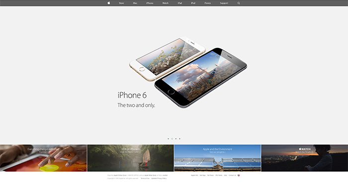
Keep in mind that when it comes to branding and marketing, seemingly universal truisms (such as “everyone loves blue”) won’t necessarily work when it comes to website color. Instead, it’s important to think about your target audience and the context you’re working with. It’s the image your brand creates that helps persuade customers. A well-known example of this is Apple’s use of white to portray the company’s love of clean and simple design.
Sometimes it’s best to stick with three main colors for a simple, yet multifaceted design aesthetic. When selecting your colors, it’s perfectly fine if you choose ones that are complementary or analogous, or if you combine primary, secondary, and tertiary. What matters is that they work well with each other and offer your site’s visitors a stimulating experience. For example, if you want to create a calm and peaceful mood, you might consider varying cool colors on a white background. Using multiple shades of the same color in a monochromatic way can foster a sense of stability and tranquility. Yogafit.com does an excellent job of exhibiting the peaceful feel while reflecting their services.

If you prefer a greater variety in your website color, think about a five-color scheme. Adding two additional colors to your scheme can inspire a fuller sensory experience for your customer. They also uniquely personalize your site and help it stand out from the competition.
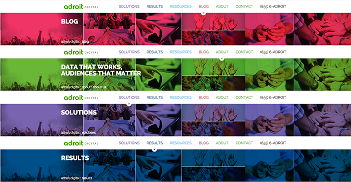
It's important however, to not go overboard in having multiple colors throughout the site. If you have certain elements that you would like to assign a specific color, such as products or services, then it is a good idea to use various, different colors. Having multiple colors as main functions like overlays or buttons can be distracting and overwhelming for the user. If the colors are assigned to certain pages or services it will make more sense and flow well. Adroit Digital uses distinct colors for key parts of their site and assign the colors to the overlays, buttons, and text to create a uniform experience.
Finally, think about the area of your website that each color will be used for. The background color most often chosen is white, as it works well with the majority of text colors. However, if you want to use color for your background, keep in mind your text should be easy for the user to read and choose accordingly.
Colors used for links, images, and text should create a sense of unity and coherence throughout your site. In addition, you want to create a sort of hierarchy for your site, by pushing and pulling content forward and back. Remember that text is secondary to call-outs, so assign your set colors to those and have your paragraph text remain a neutral color like gray.
Taking the time to choose the right colors and then putting them together creatively can have an incredible effect on a visitor’s mood and outlook. Do your research, use color creatively and you’ll build a website that people will want to return to time and again.