Do you already have an established brand? If so, you will need to select a color scheme for your website that matches the rest of your company materials. Otherwise, it will be difficult for visitors to make the proper association.
Whether you are starting from scratch or building upon an existing brand, the psychology of color is vital to color selection for your website and other business communications. A great deal of research has gone into this part of marketing, revealing the following influences upon consumers:
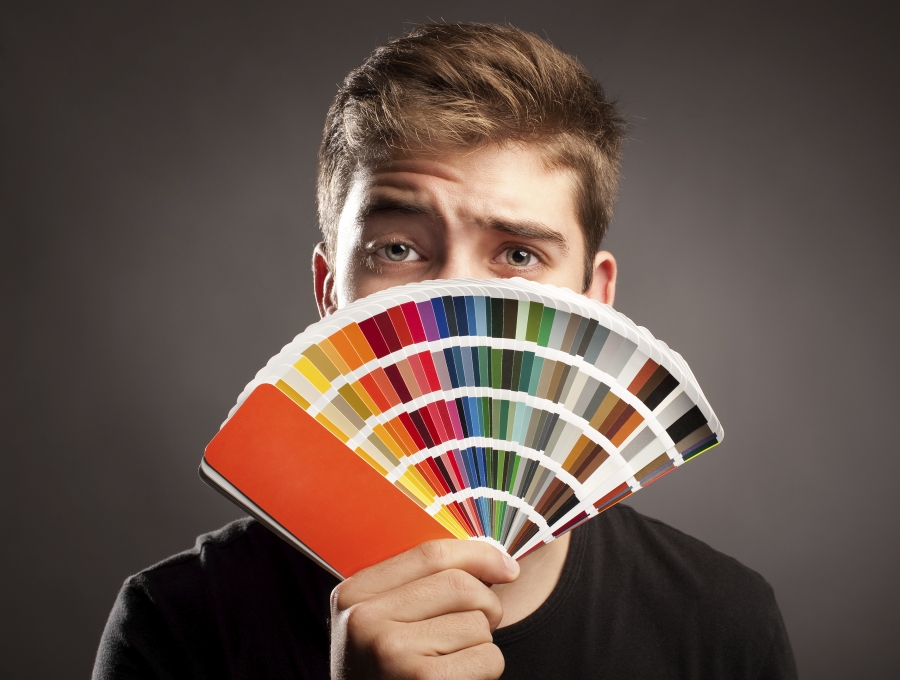
•Red creates energy and excitement. It is the color of speed and passion, and readily grabs the attention of site visitors.
•Orange evokes a warm feeling with a sense of playfulness, energy, and creativity.
•Yellow has a cheerful, optimistic vibe. Precision and energy are reflected by the use of yellow.
•Green has a calming effect and is often associated with natural goodness. This serene color can indicate both personal and professional growth.
•Blue elicits feelings of security and trust. It implies open communication and honesty from the company. Consumers subconsciously believe they can rely on a company that utilizes blue.
•Purple has long been associated with royalty and indicates spiritual wellness and increased intellectualism. Many perceive it as a more sophisticated color.
•White is considered a sign of purity and simplicity.
•Black sends a message of bold power. It can be seen as a sign of prestige and sophistication.
•Brown shows durability and reliability, ideal for use in creating an image of stability.

One method for color selection involves the color wheel, which consists of a circle containing the primary colors (red, yellow, blue), secondary colors (orange, green, violet), and tertiary colors (yellow-orange, red-orange, etc.). You can use the color wheel to select harmonious schemes for your website including:
•Complementary colors: This method utilizes any two colors that are directly across from each other on the wheel.
•Anaogous colors: Ideal if you are not using a neutral, this scheme will utilize three colors that are next to each other on the wheel. For example, blue, blue-violet and violet.
•Triad colors: This method involves using three colors that are equidistant from each other on the wheel. Red, blue, and yellow are a great example of a triad.
Once you have some colors you like picked out, the next step is to establish the ratio with which you use them. A good guideline to follow is the 60/30/10 rule:
•The main color used throughout the site should use 60% of your web space. This will tie each page together. Neutral colors are often ideal for this portion because it allows you the most freedom for the remaining selections. Additionally, most images will stand out against them.
•To create contrast, 30% of the page needs to stand out against the primary color chosen. If you did not select a neutral color for the main 60%, virtually any color will pop in comparison.
•The remaining 10% needs to complement the main two choices.
While sticking with this rule, you can take advantage of different tints and shades in order to further the amount of colors available in your custom web design. These are ideal methods for creating visually appealing sidebars and other content that will remain within the selected color scheme.
This rule also comes into play when choosing images and graphics. It’s essential that the background colors do not compete with these images. They should complement each other while allowing the photos and related data to retain consumer attention.
You need to have a custom web design color scheme that enhances your reputation and is aesthetically pleasing to visitors. Fortunately, you have options in your approach and selection that will allow you to maximize the value of your website. Using these creative insights will benefit you in developing a custom web design that properly conveys your brand message to consumers.