Designing a website to feature your products or services can be a labyrinthine process, but it's important to focus on user-friendly functionality. In order for visitors to get the most out of your site, clear-cut navigation is key. Nothing is worse than having a customer leave your site empty-handed because they couldn't find an easy way to navigate between pages.
A recent popular trend recently is the "hamburger" menu. Before you get all hungry on me, we're talking about the hamburger icon that expands a full navigation menu when you click on it. It's a great way to condense your navigation and proves to be compatible with a responsive format, but is it good for your site?
The User Interface
The hamburger icon got its name from its similarity in appearance to the classic patty between two buns. With those three little lines, the icon indicates that there is more to be seen off-screen.
The hamburger icon was developed in response to the rising popularity of viewing sites on mobile devices. To keep up with the need for mobile-friendly websites, companies were faced with the dilemma of condensing their navigation into a format that is both compact and user-friendly. Thus, the hamburger was born
While the hamburger icon is growing in popularity, the probability of a user clicking it based on just the icon alone is less than that of the icon and a word next to it:

Using "Explore" or "Menu" can increase clicks and entice the visitor to see what other items are featured. Additionally, when activated, the hamburger icon animates into an "X," indicating to the user that the icon is now a button to close the menu.
Two important questions you want to consider when deciding on your navigation design are:
1) Do I have a lot of pages to feature?
2) How do I want to display options to my audience?
With the hamburger icon, it's important to know that your navigation will be secondary to the content currently displayed on the screen. This is good if you're a service provider and your website primarily consists of who you are and what you do. However, if you have an e-commerce site, it may be better to have fleshed-out navigation with a mega-dropdown for easy access to products.
The User Experience
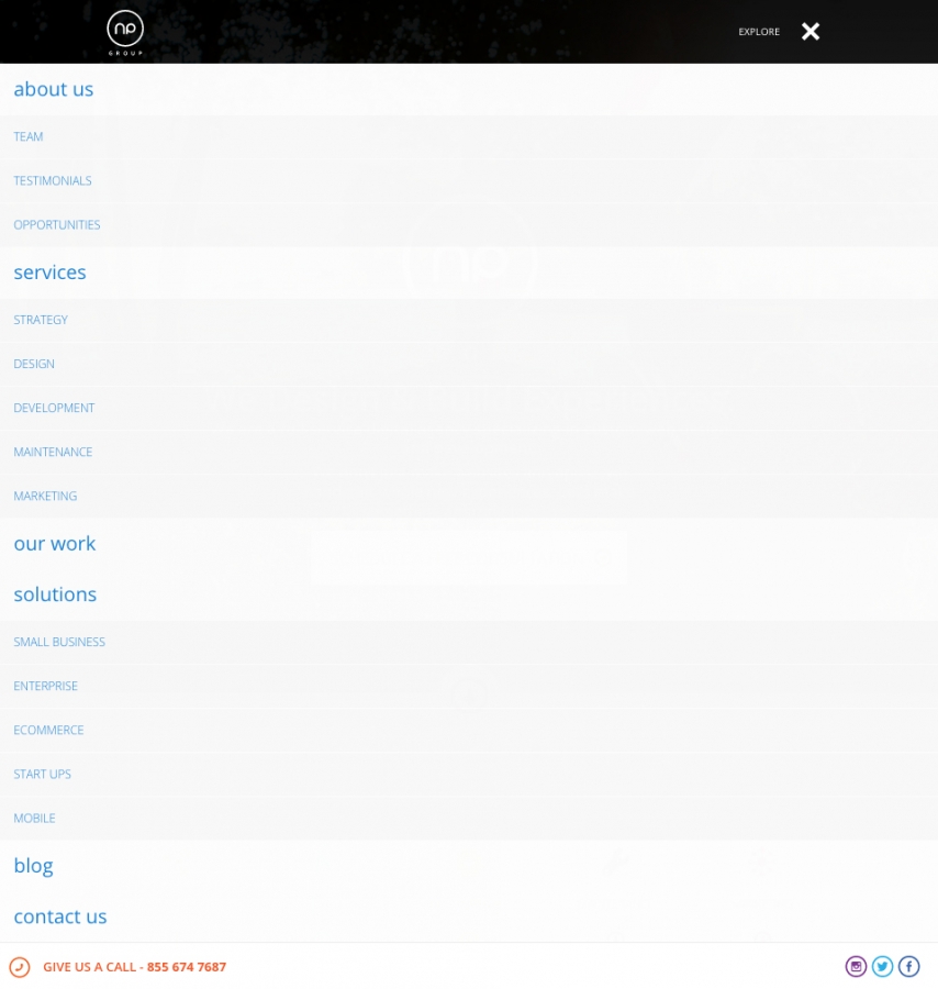
There are many ways to display a secondary navigation menu when the hamburger icon is activated. When clicked, it can display a full-page overlay with a list of items. Here, a design can display navigation links and even include sign-up or contact forms, callouts, and social icons. The full-screen overlay is definitely an elegant and informational approach:
 Another approach is to have the menu animate in from the top of the current page while only occupying a small amount of space on the screen. The menu can also slide in, pushing the content left or right off of the screen. This is popular among mobile apps, as there is little to no change to the content in the menu screen. Here, the links and social icons are easily clickable for smooth navigation throughout the site at any time:
.jpg)
While it's easy for the icon to remain responsive across all screen sizes, it might not be so easy for sites that have a lot more items to display and contain mega-dropdowns. In those cases, it would help to do extensive research on visitor behavior and focus on those in the condensed version of the navigation.
Creating an easy navigation can help you boost visitor retention and satisfaction. However, prioritizing what is important on your site and organizing the navigation accordingly is an excellent first step. Nailing the navigation is essential for completing a winning website for your users to enjoy.

