I'm going to begin this by stating in a 100% clear and concise manner that this is a 100% non-partisan and non-political post. This election cycle is so polarizing that the last thing we want to do is add to the debate. But, this is an interesting case study that deserves attention and review. Of course, I have opinions just like everyone else. Hopefully, in reading this, you'll be confused about what I think, and if that is the case, then I will have succeeded!
With that said, I'm always interested in how presidential campaigns approach the business of digital. If 2016 taught us anything, there is tremendous power in managing a successful digital campaign. National political campaigns contain all of the same concerns many of us share about our websites, but they do it all in a short period. This means scaling, security, content management, conversion rate optimization, and of course, compliance – all within a short period where there are many instances of surge usage.
So how do the candidates compare in the approach they take to their website? I've tasked myself and my team with providing you with some thoughts about how the two campaigns compare in various digital disciplines. This includes technical, design, compliance, and more. For this post, we're going to focus primarily on the two main domains in use:
https://joebiden.com/
https://www.donaldjtrump.com/
Let's take a look!
Under The Hood
The first area of interest is the technical footprint of both websites. Let's start with President Trump. His website appears to be running on Expression Engine. I find this a somewhat interesting choice, as Expression Engine is not the player in the CMS space that it used to be. However, I also believe it is a good choice because it provides a solid foundation for custom development on top of the CMS, mostly because Expression Engine was written on top of CodeIgniter, a very flexible PHP-based coding framework. Expression Engine is somewhat dated these days and by far an outlier in the LAMP-based CMS space, but it has its benefits and seems to have been an excellent decision to utilize for a campaign focused on speed and security.
The Biden campaign is surprisingly utilizing WordPress as the primary CMS. I find this somewhat of a shock because my primary concern with WordPress frequently concerns security. In the world of high-stakes politics, especially at the highest level of elected office, seeing the nominee of a party utilizing WordPress is interesting. Now, we've spoken at length before about how to best secure and harden WordPress for enterprise usage. However, given the alternatives available, the risks seem to outweigh the advantages. Hopefully, whoever worked on this site can provide a case-study when the campaign is over to educate us on how they utilized the platform.
I'm a bit sad to not see some emerging technologies in place in the campaigns. It would have been nice to see a headless CMS powering one, if not both, websites. It would offer easier scaling, tighter security, and creative control over the front-end experience. We know each candidate has the budget and team to manage and develop such a solution. I'd be interested in learning exactly which options were considered, and how they arrived at deciding the final implementation strategy.
I'd love to say I'd give the edge to one campaign over another, but I'd instead give them both kudos for embracing open-source technology, as both Expression Engine and WordPress are open source projects. Suppose I had to choose one approach that I prefer versus the other. In that case, I'd slightly lean towards Expression Engine as the direction I'd take this type of project, if only for the underlying platform and the avoidance of WordPress's known security risks. However, with that said, the Biden campaign's use of WordPress should serve as a case study for the future.
Site Performance
To judge performance, we utilized Lighthouse, a toolset within Chrome, to study some common site performance aspects. Because Google controls the world with its SEO recommendations, some feel this is the best overall tool to judge a website; as we all know, the standards Google recommends eventually become widely accepted.
First, let's look at the Biden campaign. Lighthouse test results were as follows:
Mobile
.png) I have to admit, I was somewhat shocked at how poorly the Biden campaign's website performed from a mobile perspective. While anything scoring over 85 I think is decent enough, to have a mobile performance ranking of 22 is surprising. Especially considering the adage that the younger demographic skews Democratic, you would think they would have optimized better mobile experiences. To confirm, I also ran the website across Google's PageSpeed Insights toolset, which scored the mobile site as 18 out of 100. There are too many areas of opportunity for them to optimize even to mention here, so to say we were surprised is an understatement.
I have to admit, I was somewhat shocked at how poorly the Biden campaign's website performed from a mobile perspective. While anything scoring over 85 I think is decent enough, to have a mobile performance ranking of 22 is surprising. Especially considering the adage that the younger demographic skews Democratic, you would think they would have optimized better mobile experiences. To confirm, I also ran the website across Google's PageSpeed Insights toolset, which scored the mobile site as 18 out of 100. There are too many areas of opportunity for them to optimize even to mention here, so to say we were surprised is an understatement.
Desktop
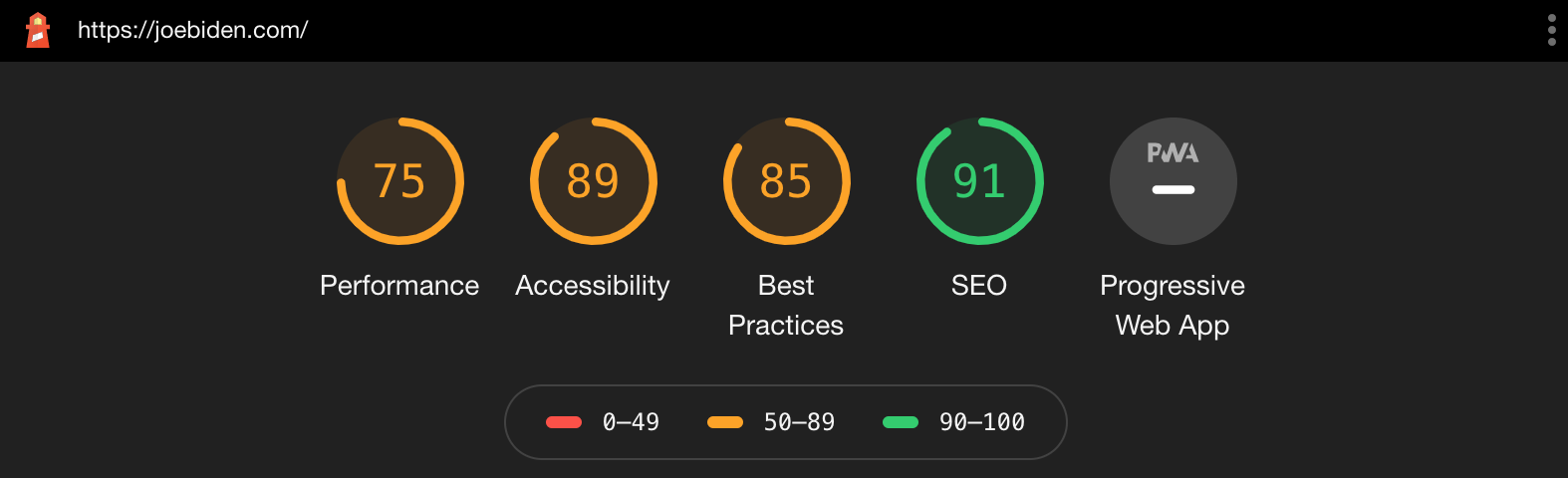 Desktop does represent a better experience for the Biden website. Their SEO optimizations are excellent, and they rank well for accessibility and best practices. However, their overall performance is still low. This carries over to the PageSpeed Insights, which scores them as 66/100.
Now, onto the President's website.
Mobile
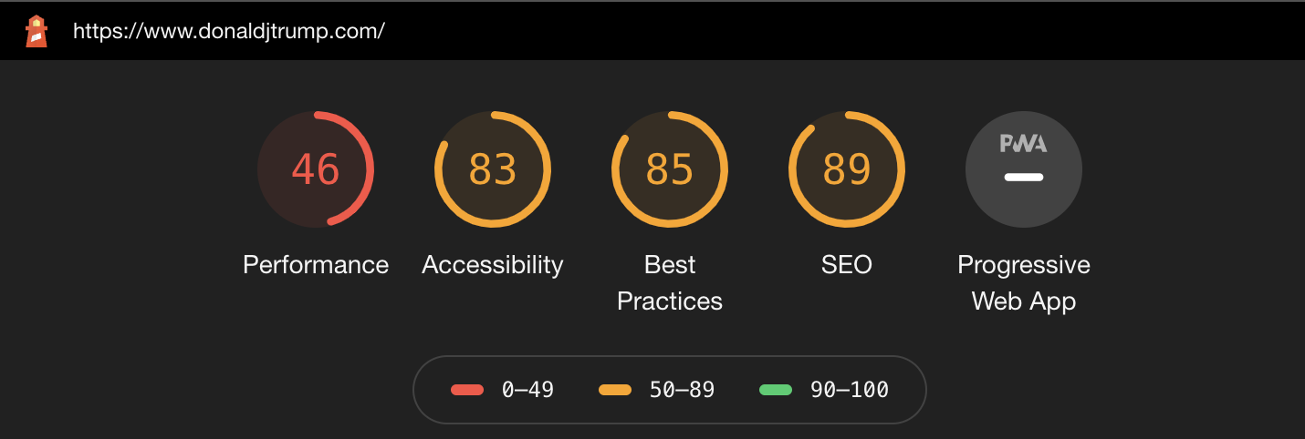 At first glance, we can see that overall, the Trump campaign has produced a slightly better mobile experience. But, overall, not much better. From the perspective of SEO, best practices, and accessibility, they do a decent enough job. However, we still feel the mobile performance score is way too low. In running a secondary test, we see on Google PageSpeed Insights that they do, however, score 48 out of 100, which is a much better result than the Biden campaign. Optimizing for mobile is very difficult. Overall, we're somewhat disappointed in both campaigns for how they deliver this experience. We would expect more focus on ensuring smooth mobile delivery.
Desktop
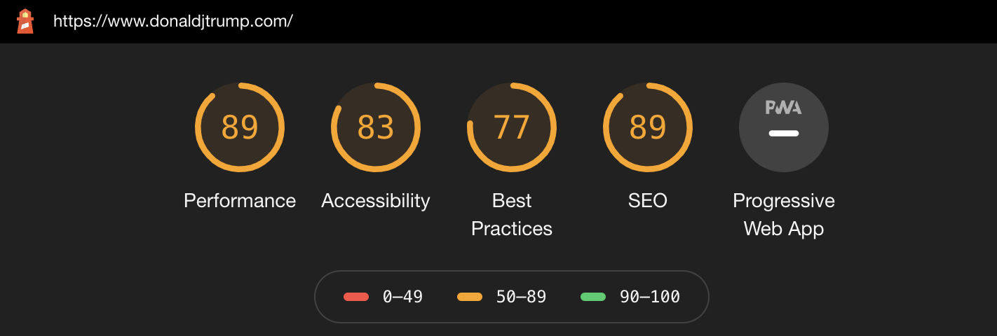 From a desktop perspective, the Trump campaign has done a decent job of measuring up to spec on each area of Lighthouse's test. They also rank 81 out of 100 on the PageSpeed Insights test. These are all good scores. I like to tell clients that you are in pretty good shape when you start ranking at 75 or above. However, it's unavoidable to admit that Google utilizes these scores from an SEO perspective. Seeing how neither campaign is overly worried about their SEO ranking, I'm sure they are comfortable with where they rank.
Overall, looking at the performance test results, I can say that there is no clear "winner" here – both perform poorly on mobile, and both are decent on desktop. I would call the performance battle a draw.
ADA Compliance
For ADA compliance, I tasked our Senior PM and resident ADA guru, Avram, to provide some thoughts.
First, a little background: Under the Trump administration, the Department of Justice has declined to issue long-awaited federal regulations on website accessibility requirements under the ADA. That ambiguity has led to an explosion of private lawsuits. Perhaps surprisingly, the Trump campaign has made an effort to have a highly accessible website. Last year, early in the campaign season, the Miami Lighthouse for the Blind and Visually Impaired issued a report on the accessibility of all candidate sites in which Biden was the clear winner and Trump was in the middle of the pack (though it should be noted that none of the sites were judged to be compliant with the ADA).
When we checked in on the candidate sites in October, Trump scored 98/100 on Google Lighthouse's accessibility report. Our visual review of the homepage found some color combinations with insufficient contrast to be legible to low vision users and illogical use of heading orders, but overall the site easily exceeds the accessibility that we commonly see in corporate sites.
In contrast, Biden's campaign site scores 91/100 on Google's Lighthouse accessibility report; the site suffers from similar color contrast and heading order issues to Trump's site. In addition to these technical issues, the site editors make use of redundant alternative text for images that can make it difficult for screen readers to distinguish between different elements on the page.
Overall, it appears both campaigns have made inroads to be compliant, and this is definitely what we'd expect from this "genre" of web properties. Again, I'd call this a draw, if not perhaps a slight win for the Trump campaign.
Design Aesthetics
For this analysis's design aspect, I asked Sebastien, our Creative Director, to give some thoughts on each campaign's website's design and layout, and incorporated his thoughts below.
Trump Website Design
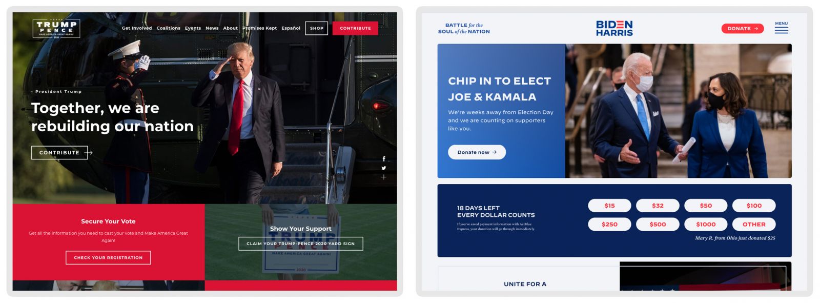
First, let's take a look at the Trump campaign site. When you first arrive, you're greeted with a large pop-up that sits on a translucent white background, barely hiding the website that appears underneath. This pop-up has no apparent "close" button, meaning you must figure out that you have to close it by clicking on the edges - this is a frustrating user experience but not unusual as a conversion rate optimization tactic.
Overall, when the site loads, it almost seems as if the website is a pre-manufactured Template. We wouldn't hold this against them either way, even though we are proponents of custom-designed web properties. This site is based on Expression Engine, making it somewhat less likely to be an off-the-shelf template, but it's possible.
From a design perspective, here are some areas of strength that we identified:
Strong use of imagery
Often, a good layout with an excellent photo says a lot more than paragraphs containing keywords. What we see here is everything the Trump campaign is trying to sell to its voter base: patriotism, military, and love of country
Good control of CTA elements within view during scrolling
This website does not bombard you with so many calls-to-action that it starts to lose its visual appeal. Abusing CTA elements can lead to a loss of their effectiveness, especially if they are stacked on top of each other with the same weighting. Users are familiar with overly spammy websites, and this website has an excellent mixture to avoid that feeling.
Messaging is short, to the point, and concise
All the homepage messaging elements are crisp and short, designed to be scanned quickly and acted on.
The homepage is short and to the point
Allowing the page to end is a good thing. Long pages loaded up with information can lead the user to become indecisive. Allowing the site to end forces the user to keep on navigating through the website.
Of course, there are some negatives to the design as well:
Poor image placement
The text on images is being abused – the site appears to have text running over people's faces and, at times, text on top of text, making content hard to scan and digest quickly.
Red is a good conversion color for CTA elements, except when everything is red as well.
They should explore using a different color for their primary CTA elements when the entire page is utilizing the same color. Your primary CTA elements should stand out more against the overall design of a website. However, this is problematic for the campaign because red symbolizes the party in popular culture, and therefore they want to use it as much as possible.
Too many navigation items
If you are looking to convert a user, the focus should always be on the CTA. Offering more secondary calls to action can cause user paralysis. As a website owner, you always want users to explore the site on your terms while simultaneously feeling they have accomplished their goals. Ever been to a restaurant with 100 items on the menu? Is that easier or more complicated for deciding than if they had five choices?
Weak mobile experience
On mobile, there are no fixed CTA elements, and all options are hidden in the navigation menu (including the donate button!). This means missed opportunities for effective CTA elements.
Lack of CTA elements
While the pages are short and to the point, they offer no strong CTA points at the end of pages beyond the footer's email subscription box.
Biden Campaign Website Design
Now, let's take a look at the Biden campaign, where a different approach was taken. Upon landing on the homepage, you are greeted with a full-page pop up that blocks the entire site. Unlike the Trump campaign website, a clear close button is visible on the top right. The pop up itself is loaded with content but with also choices for a donation amount:
Pros:
Strong CTA usage
The Biden website uses CTAs correctly, with only primary CTA elements receiving the color red. They don't use it as a background color or text color outside of CTA elements, which helps bring out the CTA's distinctiveness.
Imagery
The imagery on the Biden website does its best to avoid text over images. This is a less visually appealing approach, but it makes it much easier for the user to scan through the page without having to fight with the background images.
Fixed Donation CTA
Another smart move on the Biden website is the fixed donation CTA that appears as you scroll down the site, always present to allow the user to convert on their terms.
Singular Experience
On the Trump website, if you click on "shop" or various other links, it will open up a new tab and take you to a new website with a different look and feel. Biden's site keeps the experience all within its website. If you want to explore purchasing a product, you won't be jettisoned to a new tab, making for a cleaner user experience. Overall, this consistency adds credibility and a feeling of security to the user. Also, it provides a more sophisticated experience.
Strong mobile experience
Text is clear and easy to read, and a fixed CTA for donation conversions is present. While the menu is behind a classic hamburger icon, they still have a donate button present on the top as a clear CTA outside the menu. This site is properly optimized for donations, which is a common goal on a political website.
Cons
Hidden menu
It's essential to find a balance between too many menu items and hiding all of your options behind the hamburger icon on the desktop experience. Key pages should be listed, and essential calls to action should not require you to dig into a menu to find. Even if you were to choose to hide all the options behind an icon, it's probably best to make it hoverable and not a full take-over.
Too much content
Unlike the Trump website, Biden's focuses on having a lot of CTA elements and messaging on the homepage, creating a very long homepage experience. While the content is unique and interactive, it's not a very strong presentation. Users typically do not like to interact with content beyond hover states and clicking, which means that carousels and slideshows are not effective in delivering content to a user.
No fixed navigation on desktop
Not having a fixed navigation/header forces the user to scroll up an already long page to explore the website's rest. This is not user friendly and makes every interaction more complicated than it needs to be. A simple fixed header could have fixed this issue.
Overall, it's hard to say there is a clear winner, mostly because design is often judged in the beholder's eyes. The Trump campaign is designed for its base: it has bold colors, imagery indicative of strong leadership. The Biden campaign went for a more clean, sophisticated design and optimized for conversions. There isn't any clear winner in this rase, and I'd bet that both campaigns are probably pleased with how the site designs turned out.
Usability, Purpose & Traffic
I've broken this section out from design aesthetics because I wanted to draw your attention to an interesting difference between the two sites. For the most part, the Trump Campaign is interested in doing more than just raising money. They also seem to be building community and their fanbase. In looking at their homepage, the subtle messaging, as Sebastien indicated above, is leadership and strength. But also look at the content. Trump is pushing more directions for his users than Biden. Above the fold, they placed options to contribute, a voter registration widget, and some content speaking about the President's past years in office, and even a way to get a lawn sign. Then, it ends up with a link to the store – and we all know this campaign has done a great job selling SWAG over the years. These are all efforts to build out his brand – which we know Trump is better at than anyone else.
The Biden website has a singular purpose: mobilize anyone and everyone to help. Today, the website features the option to either donate or join a phone bank – there is no deeper goal for that area of the homepage. On an overly long homepage, they touch on issues, the shop, and other content areas below the fold, but above the fold, it is a 100% request for donations.
Now, keep in mind that the strategy of the campaigns is different, for sure. And trust me when I say that these sites are heavily optimized in terms of user behavior, especially how to drive results from each user. But I feel that the Biden campaign is much more overtly asking for us to join (or support) a team to make a change, whereas the Trump site is more about bolstering the movement and brand.
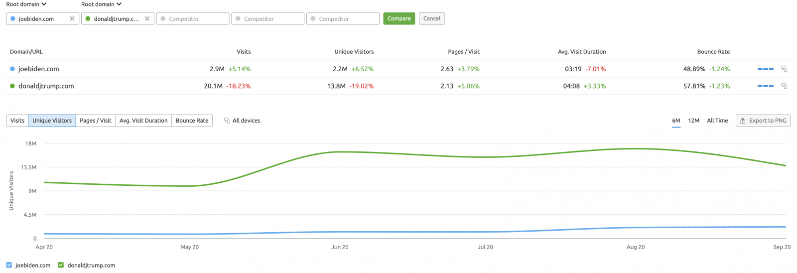
Finally, from a traffic perspective, Trump is the clear winner. His site has almost 7x the traffic of the Biden website. However, the Biden *brand*, while well-known, is not the same as Trump's, and as such, this isn't much of an indicator of site performance nor popular opinion. The rest of the statistics are quite similar:
In terms of purpose, most likely, both campaigns are happy, and for us, it's just a fascinating study in different approaches.
Who Leads the Online Race?
In wrapping up this post, I will admit it was hard to put aside our own political biases. But… I think we tried our best. In terms of the state of the digital race in 2020, it's a close call. Overall, my thoughts are best represented in a bullet list:
- Both campaigns should be commended for utilizing open-source technology.
- Both campaigns have designed an aesthetic that appeals to their overall base.
- Both campaigns have different approaches to what they are trying to accomplish.
- Statistically, both websites perform similarly.
Honestly, there is no clear winner. I'd give a slight edge to the Trump campaign and for only one reason: the digital industry slants left, and to see the Trump digital presence perform so well is somewhat of a surprise. However, they did prove in 2016 that they are digitally quite capable, so perhaps it shouldn't be so shocking after all.
One final note – regardless of whom you support – get out there and vote, people!