Choosing the right font for your custom web design project can be like picking a needle out of a haystack. With so many font choices at your disposal, where do you start? There are several points to consider before selecting a font you will be happy with:
Aesthetic Tone
Your font choice should largely depend on what kind of content you want to display. There will be a difference between a stark technical design and a softer approach for artistic or sentimental projects. It is definitely true that different fonts garner varying emotional responses. Serif fonts, for example, tend to be softer while sans serif fonts can appear more structured. Understanding the feeling you’re looking to give off is key in developing the font family of your site.
Typography First
If you know exactly what kind of fonts you want to use, you’ll be surprised how easily color and graphic design fall in line. For example, you may run into that some font weights may be too light to display on certain colors, backgrounds, or images. Remember you can always alter graphics, but you can only go so far with typography.
Legibility
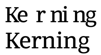
Another issue you want to avoid is picking out a font and then realizing that no one can read it. Whether it’s difficult to see on smaller screens or the letters appear distorted them, you have to make sure your content can be viewed easily. When you’re first selecting your fonts for a website, examine them carefully at different sizes, weights, and letter spacing. Most typography sites have live testers available so you can play around until you’re completely satisfied that the typeset is legible and to your liking.
Pairing Fonts
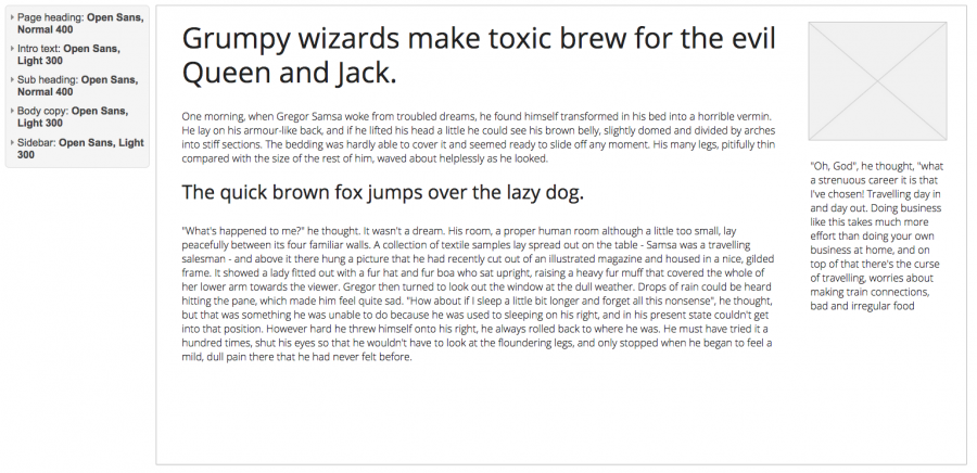
Often times there is a difference between headers and paragraph text on most websites. Testing out headers versus paragraph text and experimenting with font combinations are beneficial in solidifying what is most pleasing to the eye. Normally, as a design technique, it’s ideal to make the headers larger or bolder to grab attention to differs from the paragraph text. It’s also important to think about the style you are trying to convey and make sure you aren't mixing up two fonts that clash.
Platforms
Some fonts don’t play well with some platforms and may default to Mac provided fonts and PC variations. The recent surge in mobile web browsing adds more of a challenge to custom web design as well. A safe system for finding something that will work across the board is to check out font websites such as Google Fonts or Typekit. Overall, testing your font choices on as many different devices, platforms, and browsers is a good way to make sure visitors view your website the way that you originally designed it to look.
File Size
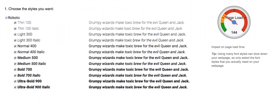
At first glance, the file size of a font may not seem like a big deal—and it probably isn’t—until your text has to be served again and again. In many cases, font files are loaded with characters you’ll rarely, if ever, use, and that takes up bandwidth. Occasionally, it can be beneficial to streamline or remove certain characters from a font. When you know which characters your text uses, it’s easy to decide whether to remove the surplus or not.
Trendy vs. Timeless
Custom web design, very much like other artforms, is subject to. Depending largely on the message you’re trying to convey, choosing a hot new font style for your entire website may end up looking dated in few months. For long-term messages, a timeless and proven typeset may be better.
Budget
Cost is always a factor in any professional creative work, and fonts that are less common and more original are surely pricier. Depending on your budget, you may want to opt for open source alternatives. There are plenty of sites offering plans and payment options available to test fonts out in your mockups via web fonts or syncing up fonts to use for a set period of time, as long as your plan is active. (However, know that not all “free to use” fonts are free for professional purposes.)
As you can see, a LOT more consideration goes into font selection in custom web design than you might think. It’s much easier to take the time and think carefully beforehand to really nail the feeling of your website design. Nothing is worse than realizing your fonts really don't work well, having to update them, and having to start from scratch. So be bold, bust out your best font faces, and your site will be gold.