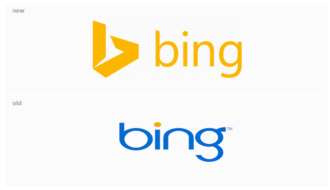
Bing has recently redesigned their logo, falling in line with their design overhaul. (See Microsoft Office 360 and in general… Windows 8). I could be a typical Apple user and just say it’s terrible because… Hey, It’s Microsoft. But that would be too sophomoric of me!

Microsoft has decided to follow Google down the path of flat design; no complaints here, there is nothing wrong with simple and clean.
What I like about Microsoft’s new logo is that even though it’s a flat design, you can still feel the 3D space the logo mark is taking up: a clever mistake? Perhaps. The new yellow borders on neon, but doesn’t cross that line, a good place to be for a color.
This new logo is an improvement over the old logo, which looked like the designer didn’t know what aspect ratio was. Overall I think the design team did a good job giving Bing a unique logo mark.


