You’ve probably seen it before. You visited a site, read the information above the fold, and upon scrolling down—whoosh! The background and foreground suddenly started moving separately from each other, creating an awesome 3D effect. You might have even played with it a bit, scrolling up and down just to see it in action. Don’t worry—we’ve done it too!
That’s called parallax scrolling, and it has become an influential trend in contemporary web design.
But is it right for you? There is always some risk involved when going for a major overhaul of your site design, especially when you start thinking outside of the box.
Here are some things to keep in mind when considering parallax design:
What is parallax in a nutshell?
Parallax is a scrolling style that uses both HTML5 and CSS3. As the user scrolls down the page, the background moves up and the foreground moves down. Its visual appeal comes from the 3D effect that this creates, which works especially well for businesses looking to emphasize motion, speed, modernity, and/or a sleek aesthetic.
How can it be used?
You’ll first have to determine whether or not your site has an appropriate place for parallax scrolling. A text-heavy site might not be the right venue, but something image-centric or even a one-page site could benefit from the effect.
It can be particularly effective as a hero image, i.e. a powerful photo at the very top of a page. In this context, the user sees the hero first and then, as they scroll down, the content moves up over the image while the image itself stays in place, gently introducing the rest of the page.
Parallax scrolling can truly compliment a site with this simple technique, as it is very eye-catching. Not only does it demand the viewer's attention, as their eye will catch the slight animation as opposed to a static image, but it also adds a bit of flair.
What about the images?
Use dynamic images that reflect your business and its core values—and don’t be afraid to go for something bold! Take your own photos to go for the homespun look, or find stock images close to your company's overall aesthetic.
Make sure to pay attention to the image file size. While the parallax effect can be coded so that the image fills the width of the page, an image file that’s too big can cause the page to load super…super…slowly. On the other hand, if the image’s resolution is too small, it will be stretched by the effect and turn out pixelated and/or blurry.
How will it jive with other page elements?
You have the choice of either letting an image stand alone before any content scrolls over it or incorporating text and other elements into that background space.
If you do want some content on top (e.g. a headline or informational blurb), make sure the background image isn't too crisp or distracting. You can create a hierarchy of visual composition by adding a color overlay or blurring the image to accentuate the content on top.
Notice here how the background image has a dark overlay, while the content on top has the white boxes to strengthen the readability of the info.

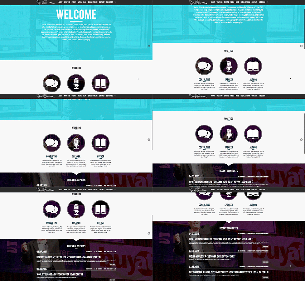
You can step out of the box and get creative! Try thinking of ways you can play with the background image and the content in the foreground. Peter Shankman’s site does an excellent job of that. You can see how the image peaks through the foreground while also forcing the icons as the main focus.

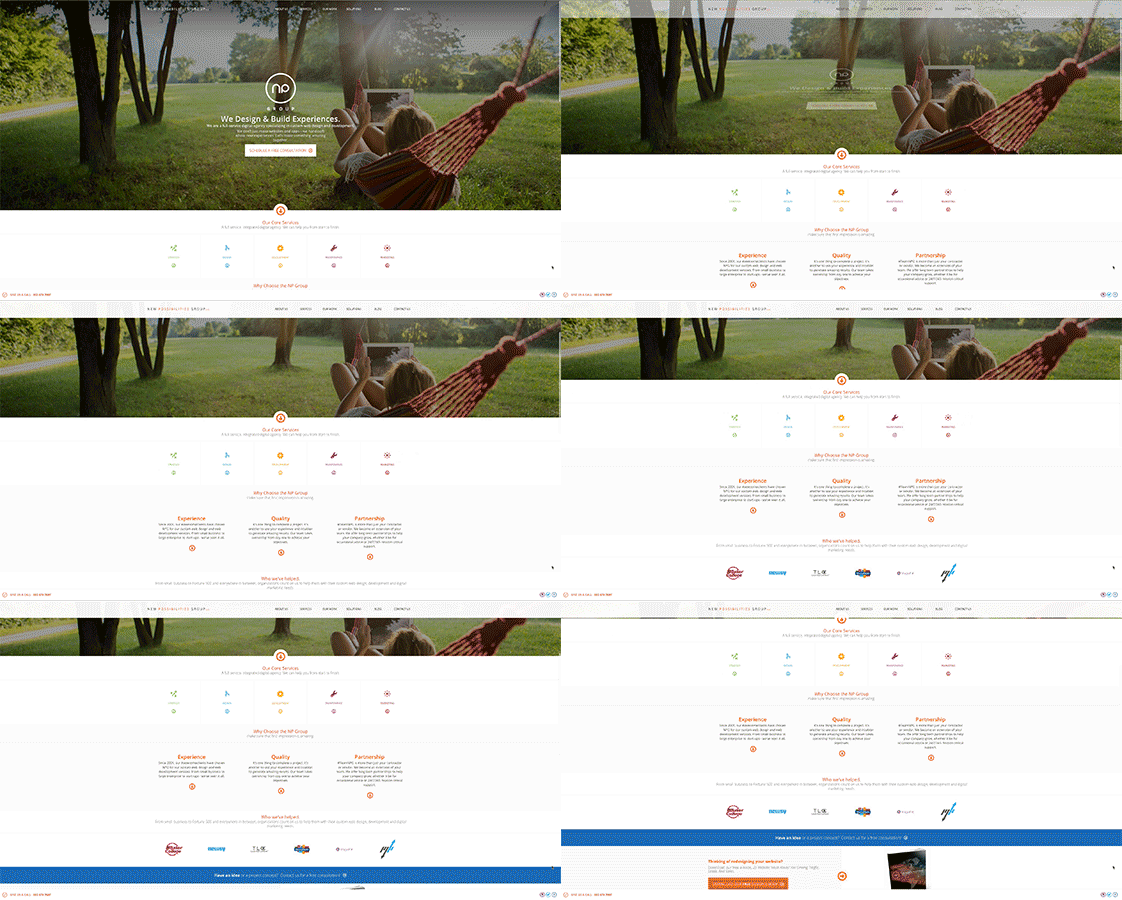
Adding modest animation effects can enhance the content and engage the user, in addition to helping the transition into the next section. Our own homepage hero actually does a pretty bang-up job of that.

We've also seen interesting one-pagers that "animate" and lead the users along a storybook adventure down the site. While this may not be a good approach for, say, e-commerce or corporate websites, it could work wonders for an individual or a company specializing in creative services. It's definitely worth knowing your target audience, what they are there for, and if your site provides that in an easy-to-navigate way. Sometimes less is more and parallax design is no exception to this rule.
While it is seems easy to just apply the parallax scrolling effect to a page and call it a day, it's crucial to first brainstorm with your team or designer and think of how you want the user to perceive not just the page, but your site overall. Remember, it's all part of your online identity—make sure you’re using it to tell the right story.


