This post is about user interfaces and user experiences, and how a bad UI/UX means the difference between your software's success and failure. But first, let me entertain you with a story…
This past weekend I had a frustrating experience. I was working on booking reward tickets on the Aeroplan website. Aeroplan is the rewards system for Air Canada. I don't think that I've ever shared in the blog or online my personal travel affinity. Yes, you could definitely call me an Av Geek and a connoisseur of travel in general. I'm always looking for good ways to gather and utilize points and miles. Aeroplan allows you to transfer American Express Rewards points for use on almost any airline in the Star Alliance. So, as I'm looking to book a ticket on Swiss, Aeroplan is a good option because the redemption is 20% less there than on United Airlines, which is my usual carrier.
 Now, this is the first time that I had used Aeroplan for this purpose. So, I had to open a new account. The website, in general, seems a bit dated, which is always an alarm bell. As we've covered before, a good design that builds credibility from first glance is still essential. This was warning sign number one. But, I proceeded anyway, opened an account, and transferred points from American Express to the system. American Express says that the transfer is instant, and sure enough, my activity feed indicated that it had received the miles. However, it only stated in one part of the system and not in my "available miles" bucket. So, I was blocked from actually redeeming. Okay, I figured – I'll give it a day.
The next day, I log in and see that the flights I wanted disappeared. Now I'm concerned. I checked another tool I subscribe to, Expert Flyer (A great tool if you fly a lot) and saw that the tickets were still available. Aeroplan just decided not to show them. I got distracted with something else, and went back a few hours later… And they were back. Weird, but good! With that, I went through the arduous booking process. The UI is confusing, with many input areas and no real connectivity through them. I finally get to the last page, where putting in my credit card fails a few times for silly reasons. And then, at last, I submit to pay…
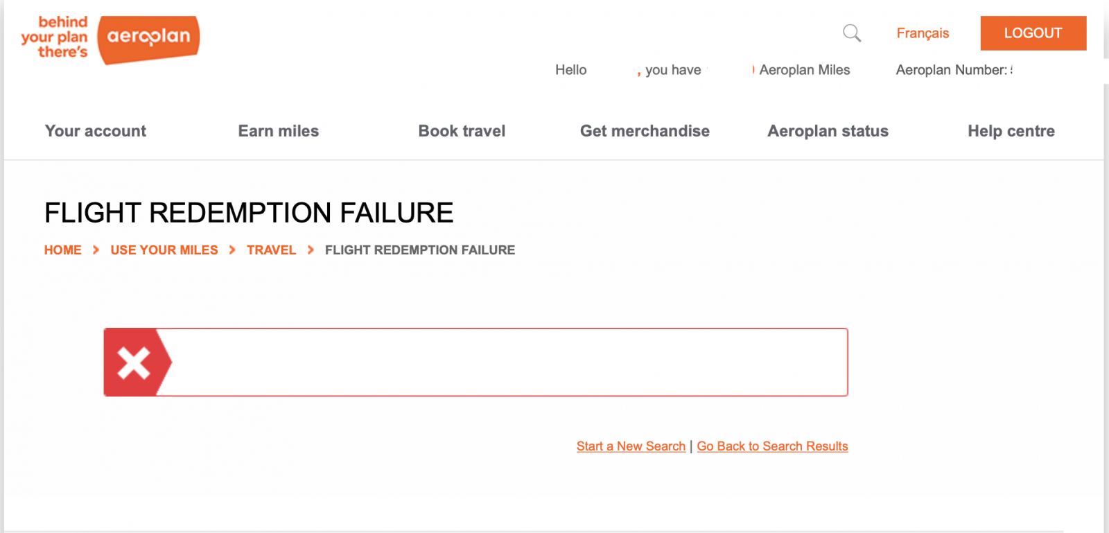 This is where it gets very frustrating. After two minutes of a spinny animation, the transaction came out with a blank error. No indication of what went wrong. And worst of all, no way to resubmit. Just an empty error indicator and the need to start over. So, of course, I started again. And again. And again. Never once did the transaction succeed. An hour later, the flights again disappeared, and I was left wondering what happened.
Here is what is so frustrating for users, whether they are in this business like me or not… The fix here is simple – just let us know there are issues! A quick Google search shows us that this is a known issue – since November! It's now still an issue in February. This means that in the 3-month span, no one was able to even put up some level of notification, which could indicate to us that there are issues and if a problem does arise, what the actual error is? It's 2020! This is "User Interface 101", people!
As of right now, Monday morning, I'm on hold with their phone bank, where I'm told the wait time often exceeds 2 hours. Insane!
What does this all mean? Quite simply, as stated in the title, software is only as good as its user interface. An in-depth list of features and capabilities does not matter if you can't actually figure it out.
UI Instills Confidence
A usable, smart UI makes the user feel safe, secure, and confident. It indicates to the user that there is a level of understanding of the inputs that the system is processing and gives a user a clear understanding of how best to proceed. No better example of this in action today exists than Tesla. I've been a proud Tesla owner since 2017, and one of the features I rely on often is the autopilot. Autopilot is the self-driving feature, which for now, we mostly use on highways. Tesla is not unique in this regard – many cars have these assisted cruise control options now. However, their UI does the best job of representing the data the autopilot has available to it at the current time.
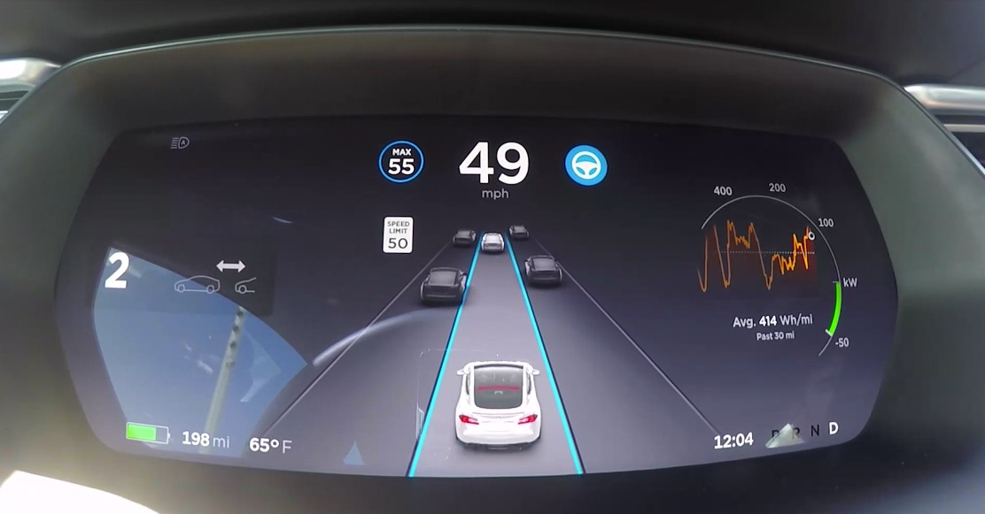 This is a dashboard view of autopilot in action. For a first time glance, it takes a quick explanation to understand what each icon means. In a nutshell, in this image, you can see the speed maximum is 55. The blue steering wheel means autopilot is engaged, and the speed limit is 50. But, the magic of this UI is the visual display of the cars which the system is tracking. It actually shows you what cars are in your vicinity, and recently, it was updated to denote trucks, too. This instills confidence in the driver because if the system is seeing those vehicles and our minds can reconcile the two, our trust level increases.
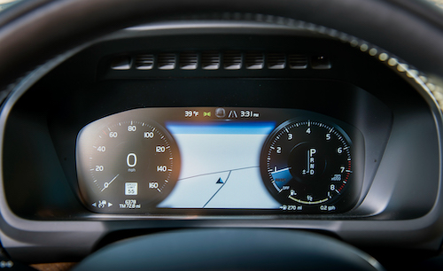 Here is a photo of the dashboard of a Volvo XC90, the other car in our household. Overall, a great SUV and the cruise control behaves about the same as Tesla. However, the big difference is in the communication from the system to the driver. The only indicator on the screen is the two lanes to the left of the time. This tells us that the system has picked up the lanes. However, it doesn't show us whether or not it sees any other vehicles.
So which system do you trust? Same hardware, same concept. Different execution. I'm sure the Volvo system is safe – that's what they are known for. But the interaction with the system has me holding the steering wheel tightly, while with the Tesla, you are more comfortable while operating in the autopilot mode.
A Good UI Sells Itself
We routinely engage in consulting work with clients performing software evaluations and recommendations. That means we see a lot of demos. One thing I can tell on a demo is how interested the client is, and what usually causes that level of interest to peak or wane. With smaller software packages, typically those that are targeted at a specific function or a niche tool, UI is good across the board. Those companies get it – a lousy UI to a new software provider is death. However, when you get to some of the more significant players in spaces such as content management or marketing automation, the story changes.
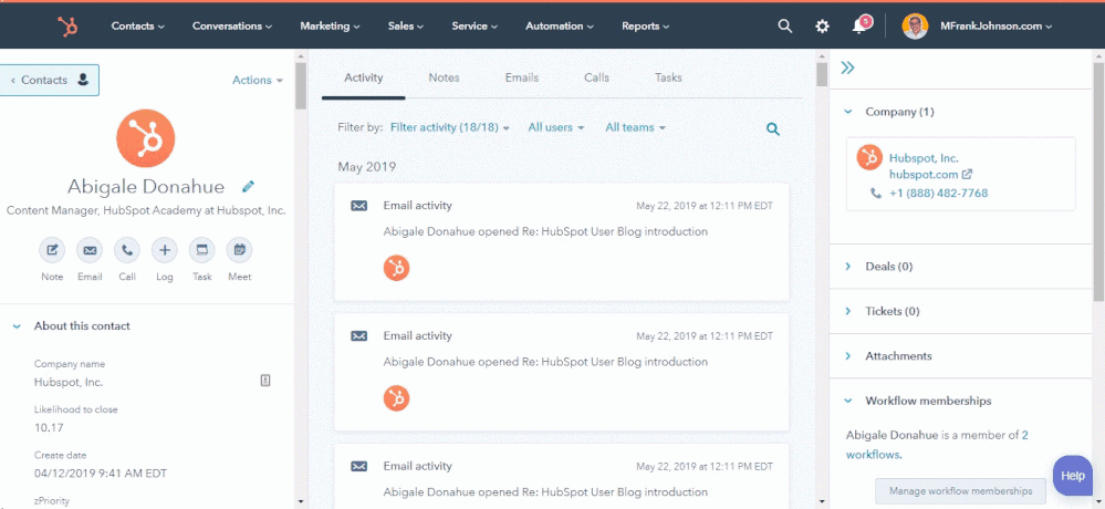 One of the scenarios we see often is in that marketing automation space. The typical players are names we all know: Marketo, Eloqua, Pardot, Hubspot. There are a bunch of secondary players in the area, too, such as ActOn, SharpSpring, ActiveCampaign… I could go on and on. But, let's focus on the primary players. For years, the clear winner in the UI battle has been HubSpot. They are routinely able to win over fans because the UI is simple and clear. I've heard clients say, "Wow, that was easy" or "I like how it just works." That's the impression users get from a clear UI. Now, it isn't fair to discount the UI at those other players. They are working to make it better. HubSpot started as an early leader with the UI of their product and have been able to expand the featureset to be almost all-encompassing while maintaining their UI. More than a few times, I have heard that clients chose their platform because of the look and feel when all other qualifiers are equal – it is a determining factor. In fact, HubSpot takes UI to such a serious level that they created a microsite specifically to explain their thinking behind it.
Think about your own usage habits, too. Have you changed any products or services because the interface and experience using it daily were better? I'm betting that you have.
A Good UI Equals Retention
Think about times you have left one service for another. UI almost always influences your decision to move from one system to another. I was using a TIVO even though my cable company had DVR and despite TIVO being a pain to get to work via CableCard. Why? Because the UI was smooth, fast, and intuitive. Only recently, after 15 years, did I dump TIVO to go with the cable company, because they finally caught up.
Excellent user interfaces mean more natural customer retention. Once you sign up a user to a service, they are going to almost instantly be targeted by competing services to switch. To win that battle, your offering must perform well, and it must make the user's life easier. This all comes down to UI/UX.
Great UI Equals Employee Happiness
In our practice of performing software evaluations, I've rarely gone into an assessment where a company seeking to refresh their platforms says their current applications are easy to use. They seldom are. Now, you could say that people are never satisfied with what they have… But in reality, people can only truly be satisfied when the platform they have takes a holistic approach to satisfy their needs. Turns out, most software doesn't! And nowhere does the use of software directly affect someone's actual happiness in performing their task than with in-house systems that employees utilize to perform their jobs.
Unfortunately, this is the area where companies invest the least. How many times have you been on the phone with support and they say the systems are slow, or down. "I don't know what's going on here with my system today," or similar. There is a long-told theory in psychology that people treat others inline with how they treat themselves… If a company puts crappy software out to its customers – can you imagine what things look like behind closed doors?
The fact is, most in-house software sucks! And employees carry that experience through to their customers or clients. Investing in proper in-house software brings with it massive benefit: Increased productivity via enhanced workflows, creation of an actual asset to your company, and above all else, employee satisfaction.
Are We in a UI Revolution?
I've noticed lately, and I think we all have that large enterprises are finally starting to wise up and update their systems and UIs. My local utility unveiled a new system for bill pay. It still stinks. But, it's light years ahead of where they were. Airlines are doing great with their booking engines these days - even if the back-end systems stink. And, even banks are working to improve their systems. What I suspect happened is the interrupters finally broke through, were noticed, and created an urgency in the enterprise to address these issues. In that way, I fell as though the most valuable asset from a technology perspective are UI/UX people who can actually work to solve these issues that so many companies have with their software usability.
So... Are UI/UX experts the next technology superstars? They should be. It takes special skills to translate technical functionality into intuitive, effortless user understanding. For years, executives have discounted a good UI team, for the most part, because the output of the endeavor is always so simple – how can it take long or cost substantial sums? It doesn't make sense to the c-suite executive. But that is the thing – good software SHOULD seem easy. It should seem pedestrian. The era of "complex software must be hard to use" is dead. Today, you shouldn't need a master's in computer science to operate a marketing automation tool.
Sadly, the responsibility for systems such as this has typically fallen into the hands of corporate IT or other development teams, who care little for UI/UX. Looking back at corporate software development over the years – UI was always the secondary consideration. If you look at programming platforms over the past 30 years – the UI widgets and components were often limited to the capabilities of the operating system that hosted the applications. On-premises, locally installed software always looked the same. Corporate IT folks who were groomed in that generation are confounded by the web-based concept, where the UI is something that can be crafted from the ground up for each system being written. I believe this connection to the development models of the '90s and early 2000s are why so many corporate platforms look crappy, and even why almost every application that is web-based yet works on Microsoft platforms or are enterprise-targeted utilize the same UI/UX widgets as Windows NT did back in the day. And yes, I'm looking squarely at tree navigation – the worst!
Where do we go from here?
While I think the revolution has started, and companies both big and small are now catching up, the process will take a while. This means that more experiences like Aeroplan are going to happen, unfortunately. Because, in an innovation cycle, there will always be lingering artifacts of days gone by. And, the next UI innovation could show up whenever, to restart the cycle.
If you are still reading this, there is only one thing you really need to take away from this entire post. UI matters – and it matters more every day. It's worthy of your investment of time, budget, and research, whether it's customer-facing or in-house only. It may, at the end of the day, be the only factor that matters to client acquisition or employee retention.
