Banner ads have been known as a source of irritation in the past, but they don't have to be eyesores anymore! With proper design and incentivized wording, banner ads can actually increase traffic to your site and help your business grow.
Image Size
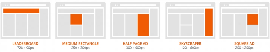
You want to start with the basics and, through some research and observation, you might notice that there are some size dimensions that are most successful in displaying and fitting your ad onto any webpage without issue. Common banner sizes range from:
- Leaderboard (728x90)
- Medium Rectangle (250x300)
- Half Page Ad (300x600)
- Skyscraper (120x600)
- Square Ad (250x250)
File Format
In addition to the standard dimensions, you have to keep in mind file types and sizes when designing your own ad. JPEGs and PNGs are typically used to display static ads, while GIFs and SWFs are better known for animated ones. Another important thing to remember is that smaller files mean quicker load times—keeping your site visitors waiting means you’ll be missing out on potential conversions.
Clear Messaging
It really makes or breaks the advertisement if the message you are trying to effectively communicate with the user isn't comprehended quickly. Successful ads are short, sweet and to the point. The user may only look at an ad for no more than 2-3 seconds. You need to make sure your message is condensed and you get your point across with a few, carefully chosen words.
Call-To-Action
With a strong call-to-action, you’re a lot more likely to generate great conversion results. Your CTA text should be short—at most, a one-sentence header and one-sentence subheader. Words that give clear directions, like “click here,” “submit,” and "join now" are proven to show high results in the number of clicks. Further, the message should incentivize the user to click on the ad. This can be accomplished through ways of offering benefits, such as deals, sales, and trials.

Images & Graphics
Just like the text, use of images and graphics should also be minimal. When using pictures, choose something that can either fit all standard banners or you can keep the image abstract with fewer main focuses. Try selecting landscapes or images with one subject, but plenty of space around it to ensure that it fits into the various standard dimensions.
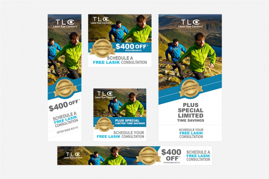
Effects like slightly blurring the image or adding color overlays can help push images out of the foreground so it’s not competing with the call-to-action. Remember to select colors appropriately so you don’t distract the user from seeing the message; try to avoid super bright colors and use more subtle tones to push the background back.
Branding
Finish up your banner by double-checking that your images, colors, text, and of course, your logo, are clearly presented. Consult your branding guide to confirm that your typography, color choices, and button usage are consistent with the rest of your website. By establishing brand unity throughout your promotional materials, you are helping to build visitors’ trust.
Placing a logo in the banner design will not only demonstrate who the ad belongs to, but it also draw a visual connection between the ad and the page they will directed to after they click on it. Logo placement depends on each ad size, so you may have to shift accordingly.
Now that you have the fundamentals to create ads that will successfully increase your conversion rates, you just need to follow these steps and remember to keep it short, simple, and clearly identify what’s behind it. Just imagine yourself as your own potential customer looking at the ad—what would catch you eye and make you want to click on it? Once you find that, you've got yourself a knockout ad.