People are constantly tapping and swiping away on mobile devices. A lot of websites are redesigning with responsiveness in mind, but the focus should really be on thoughtful touch design. Thinking of how your site is going to function on a device before starting on the desktop design can help with the transition down to mobile. Making elements as modular as possible from the beginning will make it a breeze to size down with minimal hiccups.
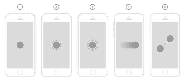
Important Gestures
There may be hidden content off-screen with indicators that let the user know to perform a gesture or action in order to reveal it. This can come in various forms, such as sliders, hidden navigation menus, or even dropdowns. To display elements, any one of the following gestures can be performed:
- Tap: A light, quick pressing down on the screen to activate linked text or images.
- Double Tap: Typically used to zoom in on an area.
- Press/Click: Can sometimes be used as an action button (e.g. hold down to record)
- Swipe: Dragging in a direction to show an item off-screen; typically used for image slideshows.
- Pinch & Spread: An action typically used for zooming in and out.
Location, Location, Location
There are a few prime gesture spots on a mobile device, although it largely depends on the finger the user is using. While there is free range when it comes to the index finger, the thumb is actually a different story. Sometimes only one hand is free and a user not quite willing to let go of that latte just to get around a website with more ease! That's where the thumb comes in. It becomes a bit of a challenge to navigate the entire live area of a mobile site due to the limited range and length of a thumb. Typically the bottom left or right corners of the screen are prime locations for a thumb to tap, so consider placing important buttons or bottom secondary navigations accordingly.
Size Matters
This point applies to buttons, navigation items, callouts, and active images and links. Users will be using their fingers to tap these hot spots on the screen and you know there's nothing more frustrating than trying to click a link and failing because you didn't hit it exactly right.
The absolute smallest a button should be is 44 pixels, although it can range from 44-57 pixels for optimal clicking. For thumb users, however, going up to 70 pixels is ideal. Having buttons range within these numbers will make it easier for users to make their target. The larger the target buttons are for the user, the more likely they’ll hit their target within a shorter amount of time, making it easier for them to navigate your site.
It also helps to differentiate between buttons that sit side by side, depending on the width of each. The smaller the buttons are next to each another, the more chance of the user accidentally clicking on one that they didn't mean to click. ProMartialArts.com, as an example, has their navigation set up with comfortably sized buttons for users to easily hit each one.

Finding A Happy Medium
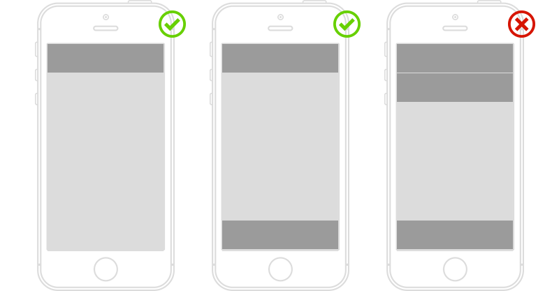
I know I just told you the benefits of larger buttons, but mobile has limited live area, so size needs to be carefully thought out in order to use that space wisely. Going too big can drastically reduce screen space and make it hard for the user to view important content on the page. Minimizing items such as navigation can help maximize the available space in the live area of the screen. Also, while it’s awesome to have fixed navigation bars either on top or bottom, it’s important to think it through before stacking multiple anchored navigations, as it can really reduce the visibility of the content beneath it.
Following through with a functional mobile design is a very important step to take in your online business strategy. Now that you've got the "rule of thumb (and pointer finger)" down, it’s time to apply it and enhance your user’s experience through the art of touch design.

