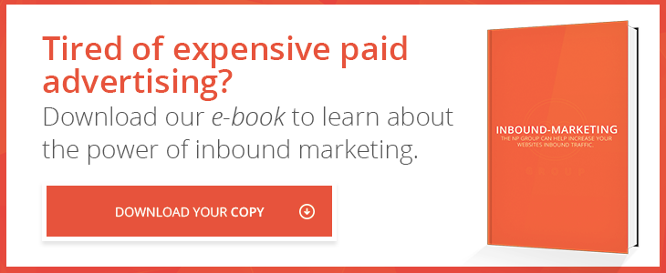
You are probably investing a lot of time, energy, and money into digital marketing so that you can generate sales leads. You know that your content, custom web design, and SEO efforts would be woefully unsuccessful without a solid call to action (CTA) to guide consumers down the sales funnel.
But how do you know for sure that your CTA is going to be effective? Take a look at your CTA and see if it has these necessary qualities:
It has great content to back it up.
Before you can tell someone that they need to act, you need to help them understand why they need to do so in the first place—this is where your content comes in. Preceding every CTA should be compelling content that develops an interest in what you’re offering. Your website's blog posts, for example, should spend between 400 and 2000 words helping readers learn how they can solve a problem, then include an invitation to engage with a related content offer.
It creates a sense of urgency.
By the time someone sees your CTA, they should be excited about the offer. However, even a thoroughly energized consumer won't necessarily take the next step in the sales process if there is no urgency. In order to create the needed sense of urgency, you need to use active language. For example, instead of saying, "You can learn more here," say "Learn more about how to (solve a problem that your company's products or services can solve) today by clicking here."
It gets straight to the point.
Don’t hesitate to appeal to the shortest of attention spans when developing content around a CTA. In order to make sure that your CTA is effective, you need to make sure that people are reading the entire thing; you can do this by making text concise and picking a simple design. Also, make sure that your links are simple and direct, and your forms are easy to fill out.
It’s not presumptuous.
A hard-sell CTA tries to force consumers to make tough decisions when there are many options (including alternatives to your business). For example, your website shouldn’t include a pop-up message with a CTA asking a consumer to sign up for an email list for "exclusive" discounts before you have used strong content to build up excitement. This is because it forces your website visitors to make snap decisions about whether or not they want to your information. Because it blocks access to the rest of your website, it creates the impression that one has to choose between signing up immediately, losing access to the offer, or not being able to access the rest of the website at all. This is more likely to increase your bounce rate than to actually generate leads.
It doesn’t have to work hard to be noticed.
When a person sees your CTA is just as important as the content that it includes. If someone sees it before they understand the value of the offer, then they will completely ignore it. The design of your website’s pages should be done with your CTA placement in mind. The CTA should be found immediately after the content that defines your business and what it can do.
It’s not competing with too many other CTAs.
Even great CTAs can be counterproductive if there are too many. Even if all of your CTAs are funneling people to the same place (which they shouldn’t be), they give people the perception of too many decisions to make. For example, your site’s design can be intuitive and aesthetically pleasing, but if every button, blurb, and sentence includes a call-to-action, people will be overwhelmed with choices. Your digital marketing campaign's success hinges on your ability to give consumers confidence in their decision to work with your company. An overwhelming host of options will harm your ability to do this.
In order to bring leads closer to the sale, you need to guide them to the next steps. Calls to action are among the most powerful tools that you have for this, so make sure that its effectiveness is optimized.


